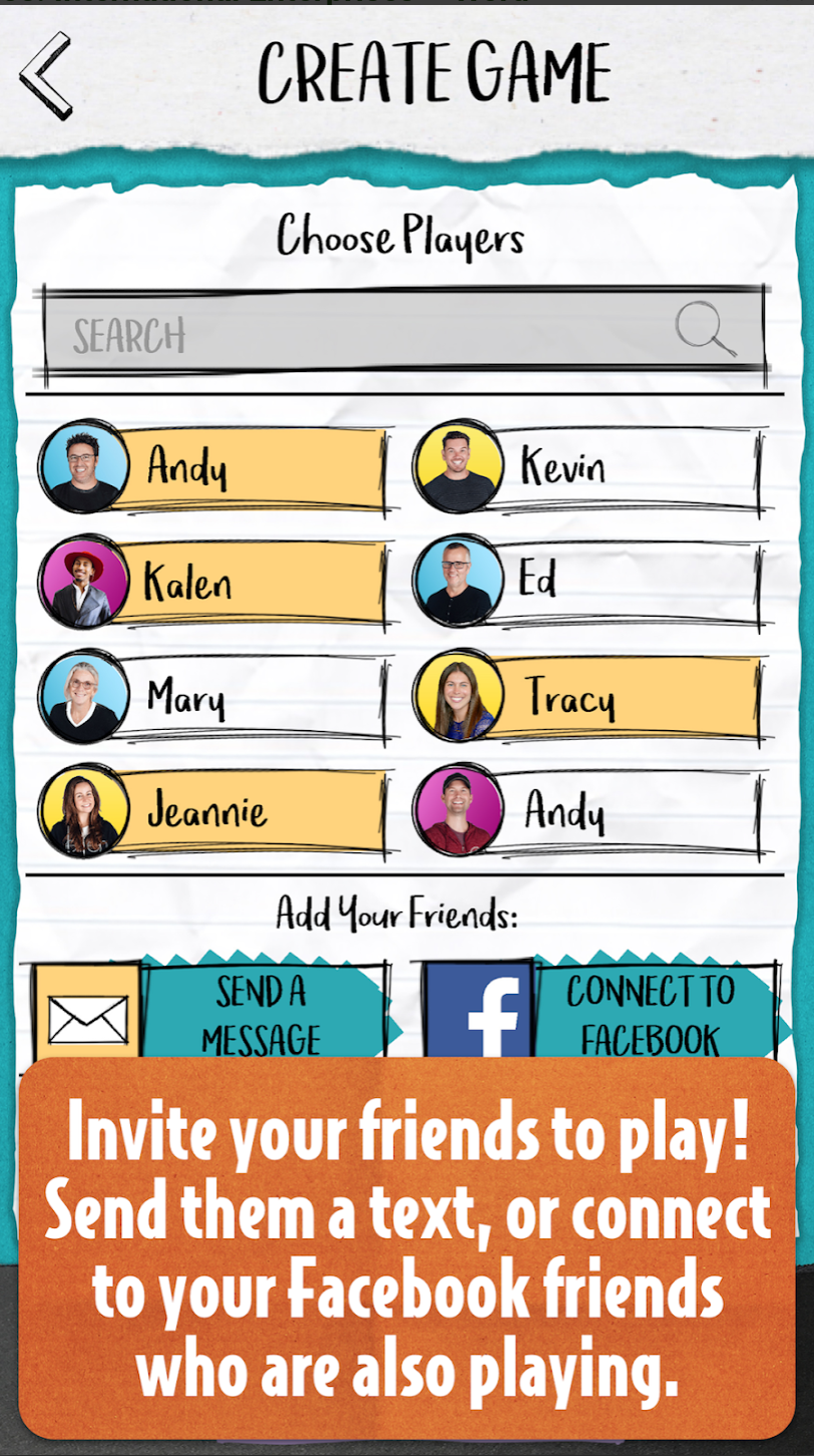
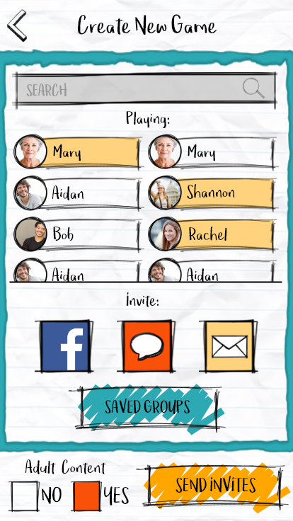
For the development of The Truth Comes Out, I was the sole UI/UX Designer on the project. Additionally, I oversaw and created the art direction and visual branding for this product…including creating just about all UI assets and the logo. A huge part in my approach when working with clients is to understand their brand and the pillars that support what their company stands for. The client for this product, wanted the game to feel fun, lighthearted, social, and playful.
The initial research and exploration for the art style took many different directions, from 80s pop to minimalist modern neon colors before focusing in on the nostalgic grade school notebook doodles.
The notebook sketch style was a direction we found our target audiences related to as majority of people had scribbled, doodled, and drawn in their notebooks at one point or another during grade school. This style and color scheme was casual, social, fun, and very approachable which worked well for our client.
Before the art direction was finalized, the UX flow was initially drafted in wireframes and created in Unity as gray boxes so that we could evaluate the UX flow and feel of the product as early as possibly as the game is highly reliant on timing for the social momentum. The timing and pacing in which the players saw various items was probably the largest hurtle from a UX standpoint. Especially because there are multiple rounds within a game and there can be several players answers and scores to present.
We added functionality so that players can add friends from social media, push game results and answers to social media, and select individual friends to play games with.


